
Project information
- Category: Print Design
- Client: J. Henry Bourbon
- Project date: Spring 2023
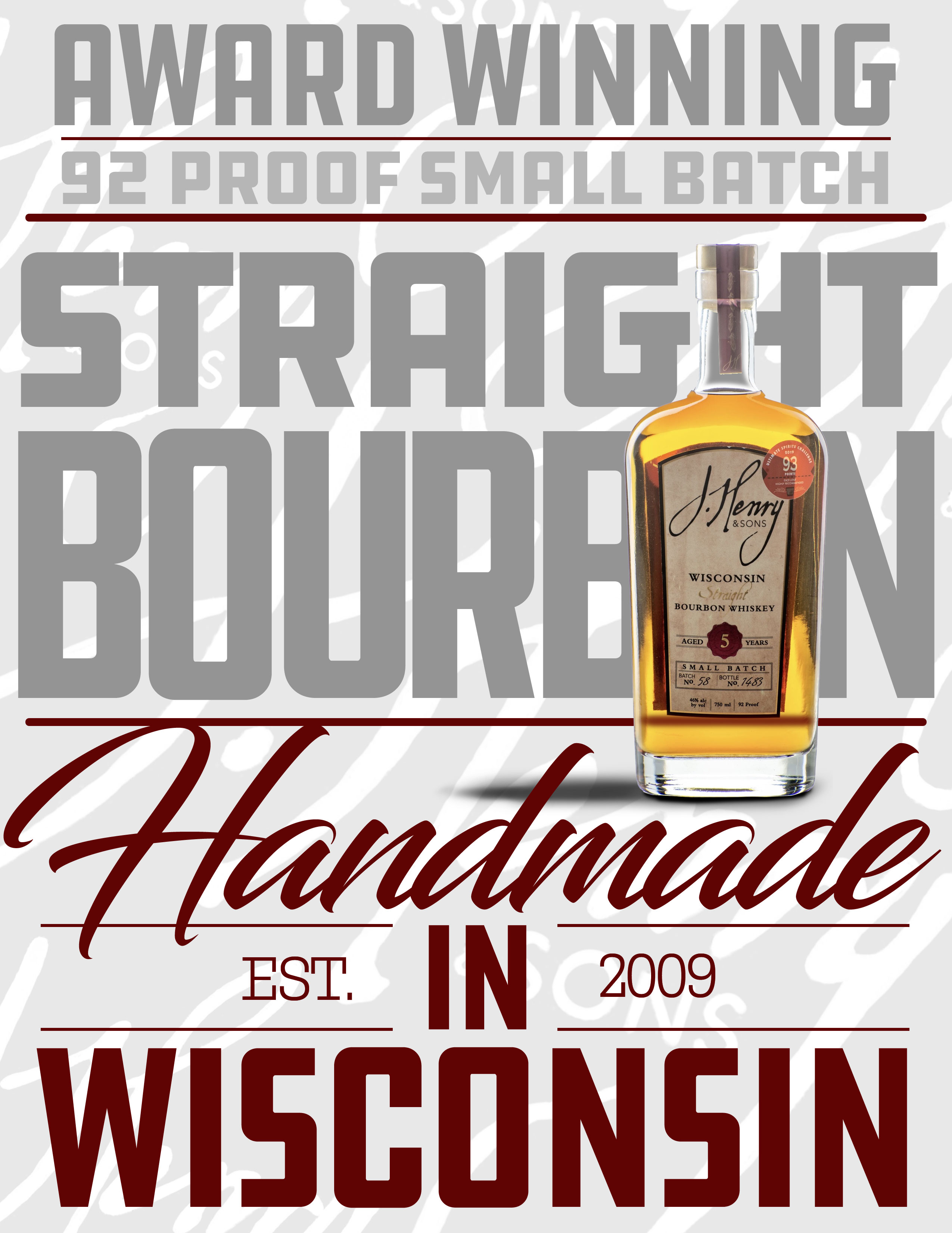
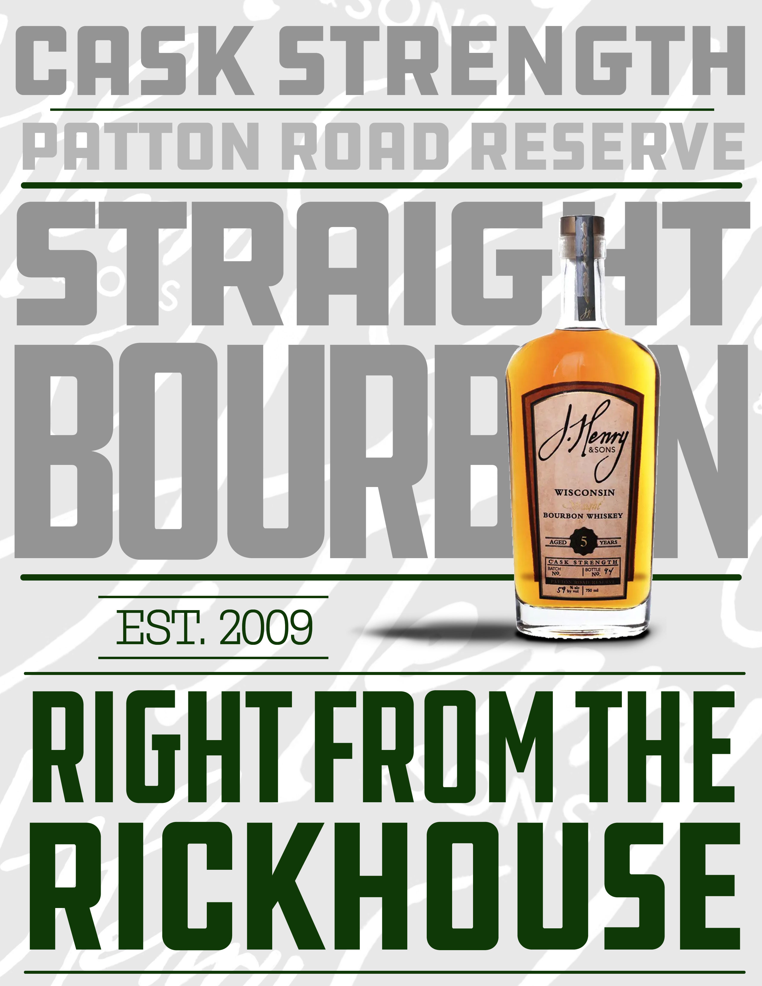
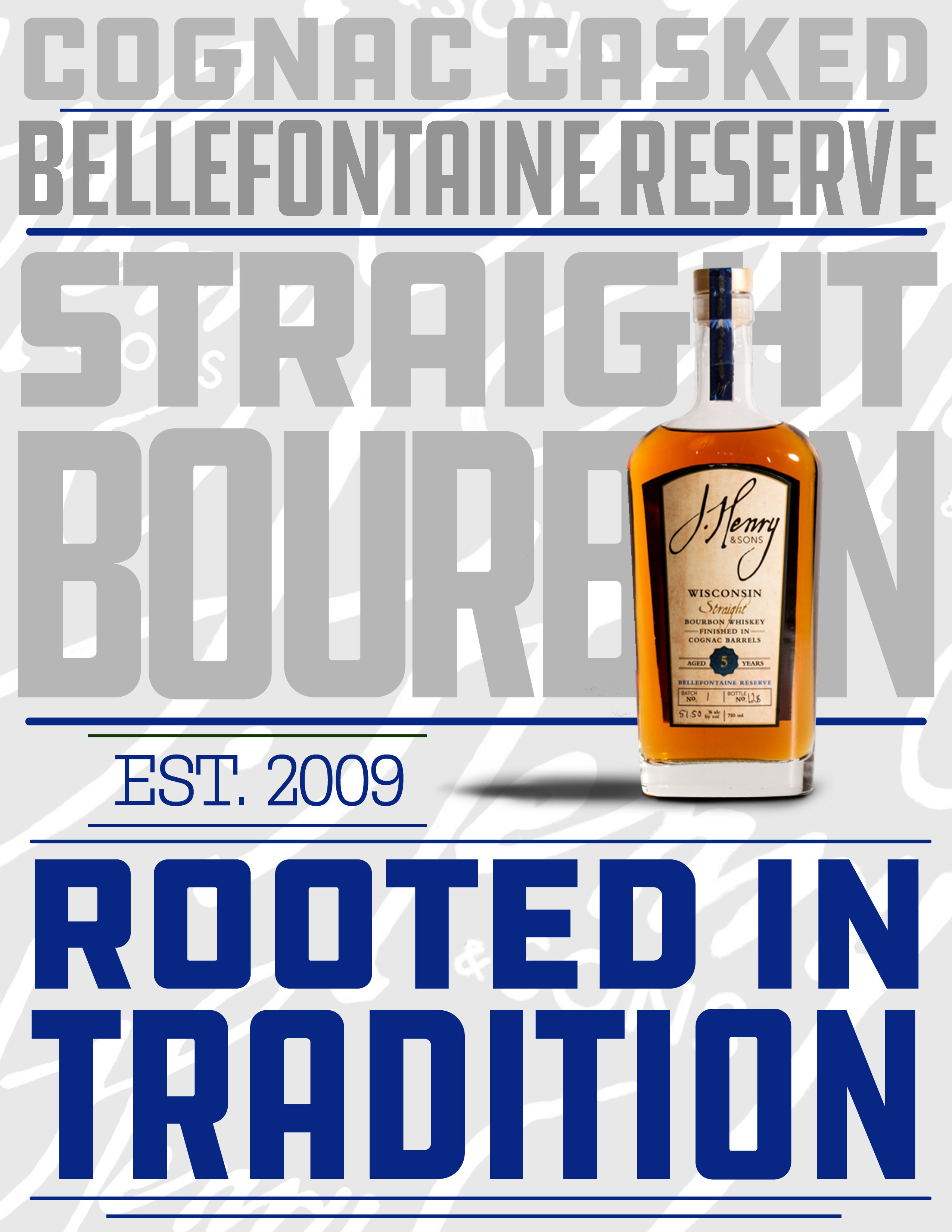
J. Henry Bourbon Typographic Ad Series
Pairing type is crucial to gaining that polished, dynamic look to design. The intention with this project was to use at least two different typefaces to unify a triptych of ads. I chose a local company based in Dane, Wisconsin, J. Henry Bourbon. I was fortunate to take a tour of the J. Henry distillery years prior and what I learned is, J. Henry is a sturdy, hardworking, family run company. I wanted to represent these principals in the ad series, but also wanted to lend a bit of elegance as well. With bold colors and flowing script doing the work of the elegance, there needed to be a sturdy type to be paired. The week I was working on this project I happened to meet prolific designer Aaron Draplin. I asked his opinion on what sort of strong hardworking type could be paired with an elegant script. Naturally, he suggested DDC Hardware and he couldn’t have been more right, so it all came together. Solid bespoke colors, a handwritten script, and DDC Hardware to hold it all together. These pieces have a sturdy, yet elegant feel to them that pairs well with the ideology of the company.