Project information
- Category: Print Design
- Client: Science on the Square
- Project date: Fall 2022
Science on the Square
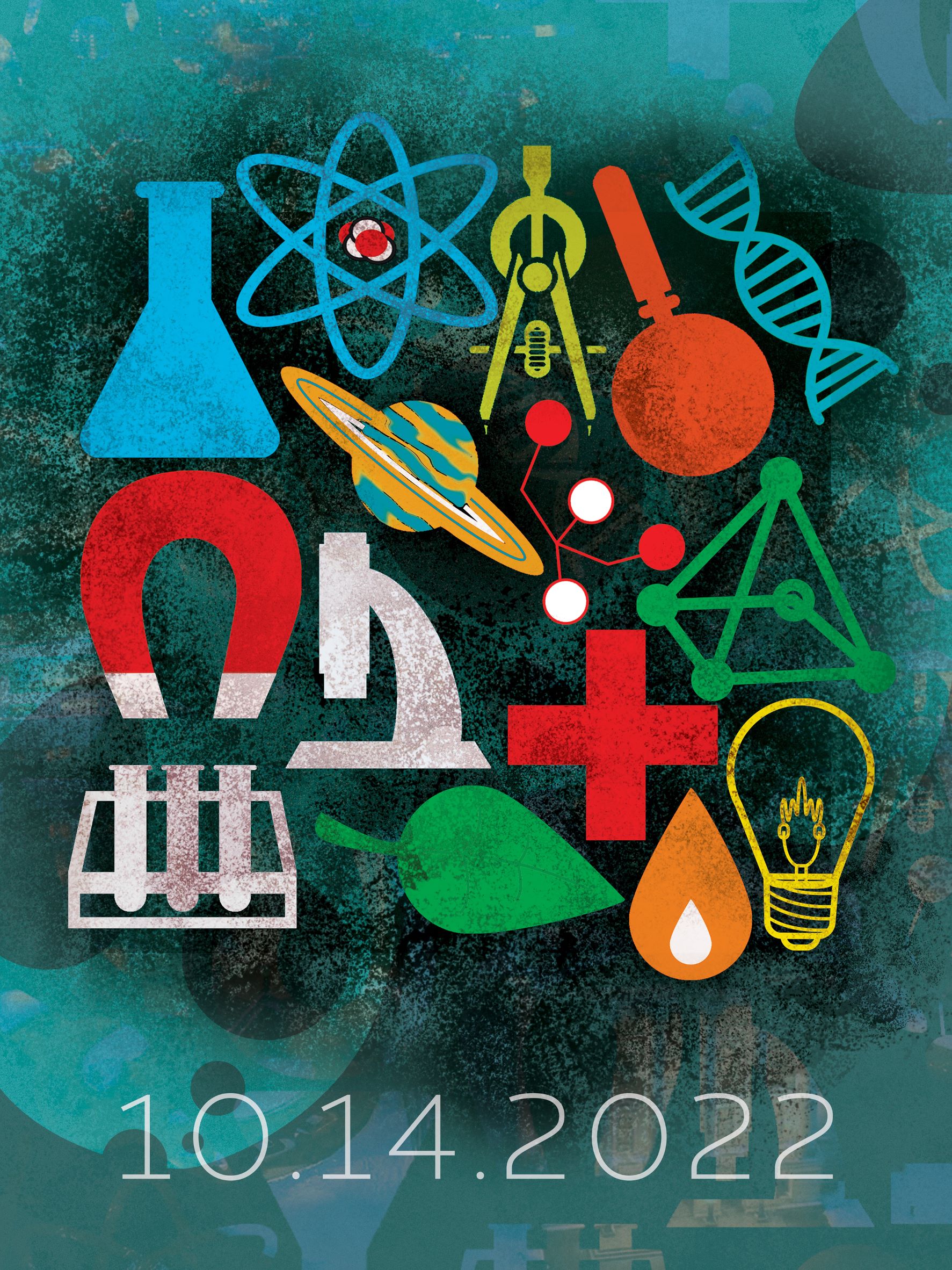
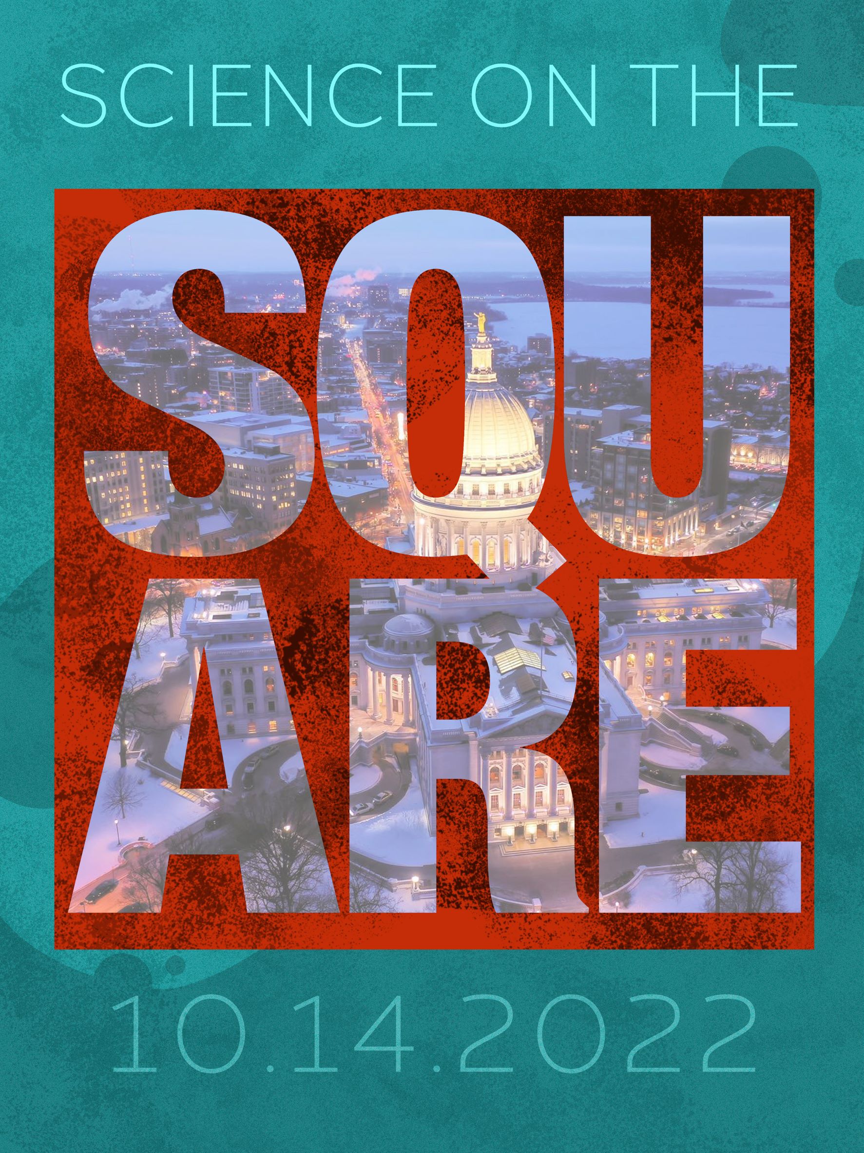
This is a set of posters to be displayed as a pair, one being graphic dominant, the other being typographically driven. I've always admired the old Bauhaus Design School posters, simple shapes and geometric type all laid out in a perfect composition. I wanted to take that idea and split it into two, using scientific icons done in flat color arranged in a square to drive the message subliminally. For the type driven poster I used bold colors and contrasting type to gather attention, and subtle textures to break up the flat color. Overall, these two posters compliment eachother but also have enough graphic fortitude to stand alone.


